BeeKey needed an identity that reflects innovation, trust, and efficiency without feeling gimmicky. The brand had to highlight its collaborative hive spirit, while differentiating itself in a competitive HR-tech landscape.
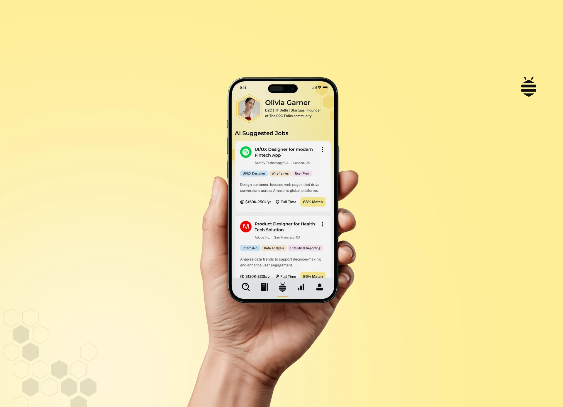
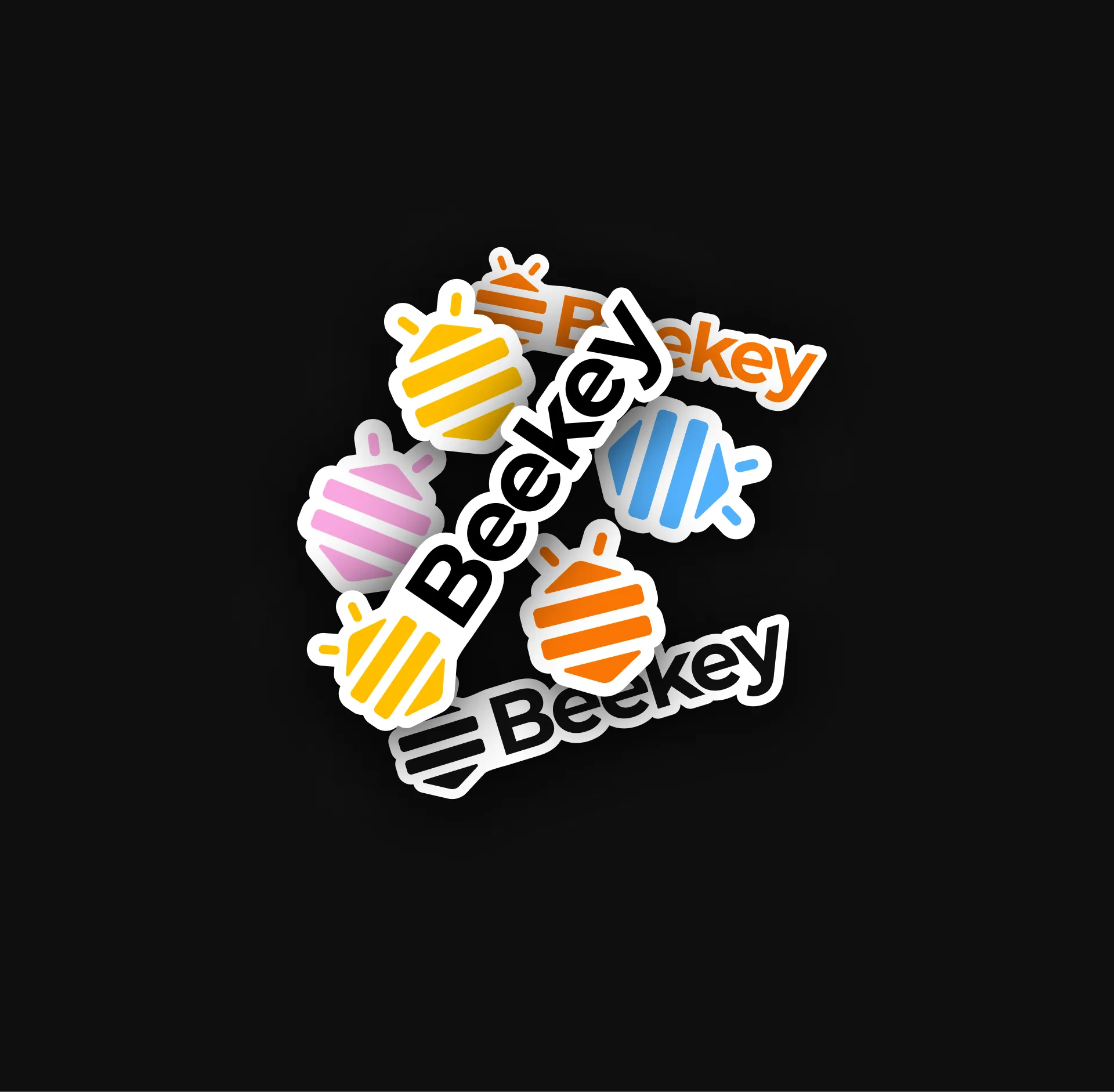
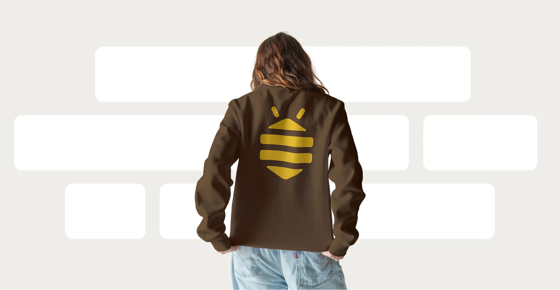
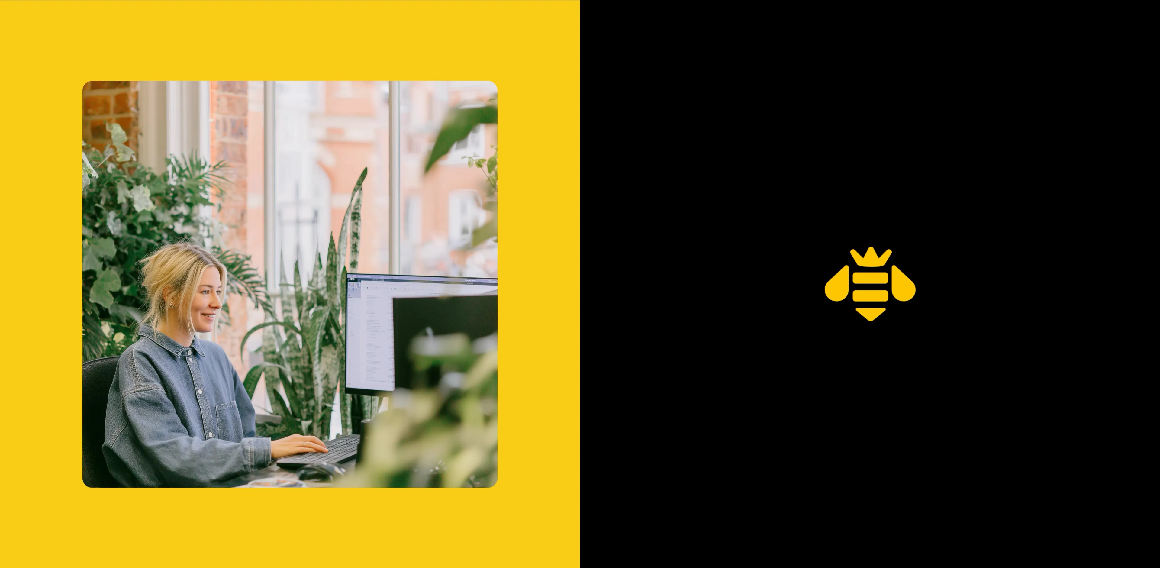
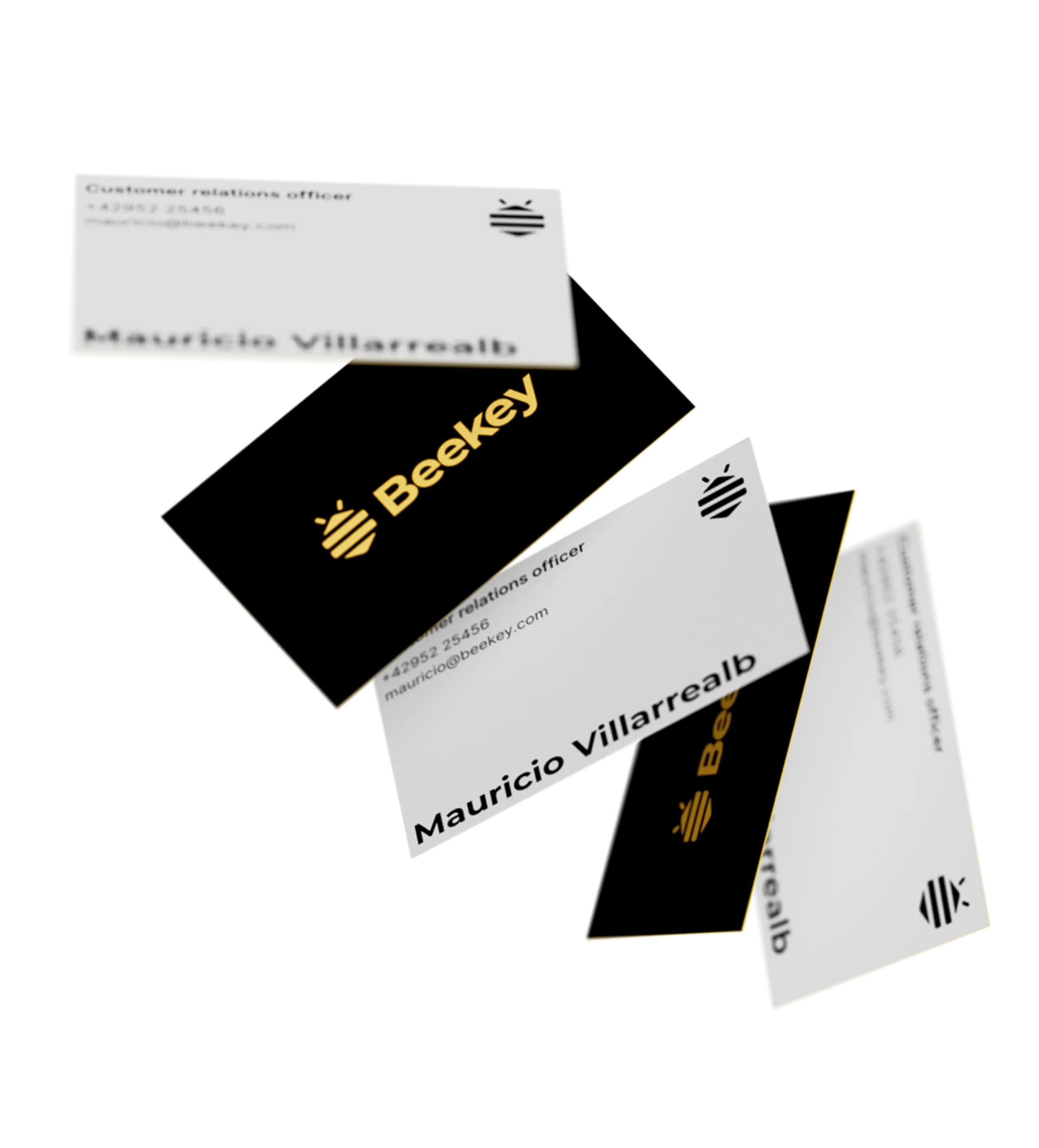
We created a distinctive brand system built around a geometric bee mark that integrates the essence of a hive cell, the form of a key, and the energy of a bee. This symbol anchors a design language that is scalable across digital-first products and physical touchpoints.


.webp)
.webp)
.webp)
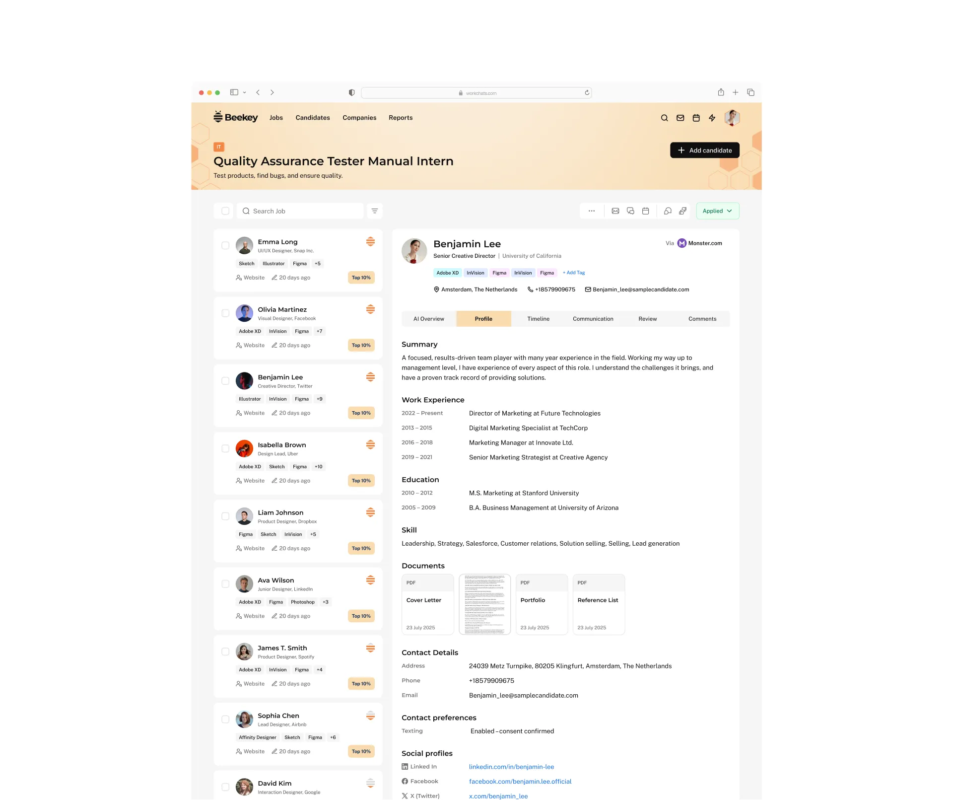
Striking a balance between authority and approachability. Montserrat serves as the header typeface, delivering structure, confidence, and a bold presence that commands attention. Paired with Public Sans for body text, the brand maintains clarity and readability while projecting a modern, friendly, and approachable voice across all platforms.
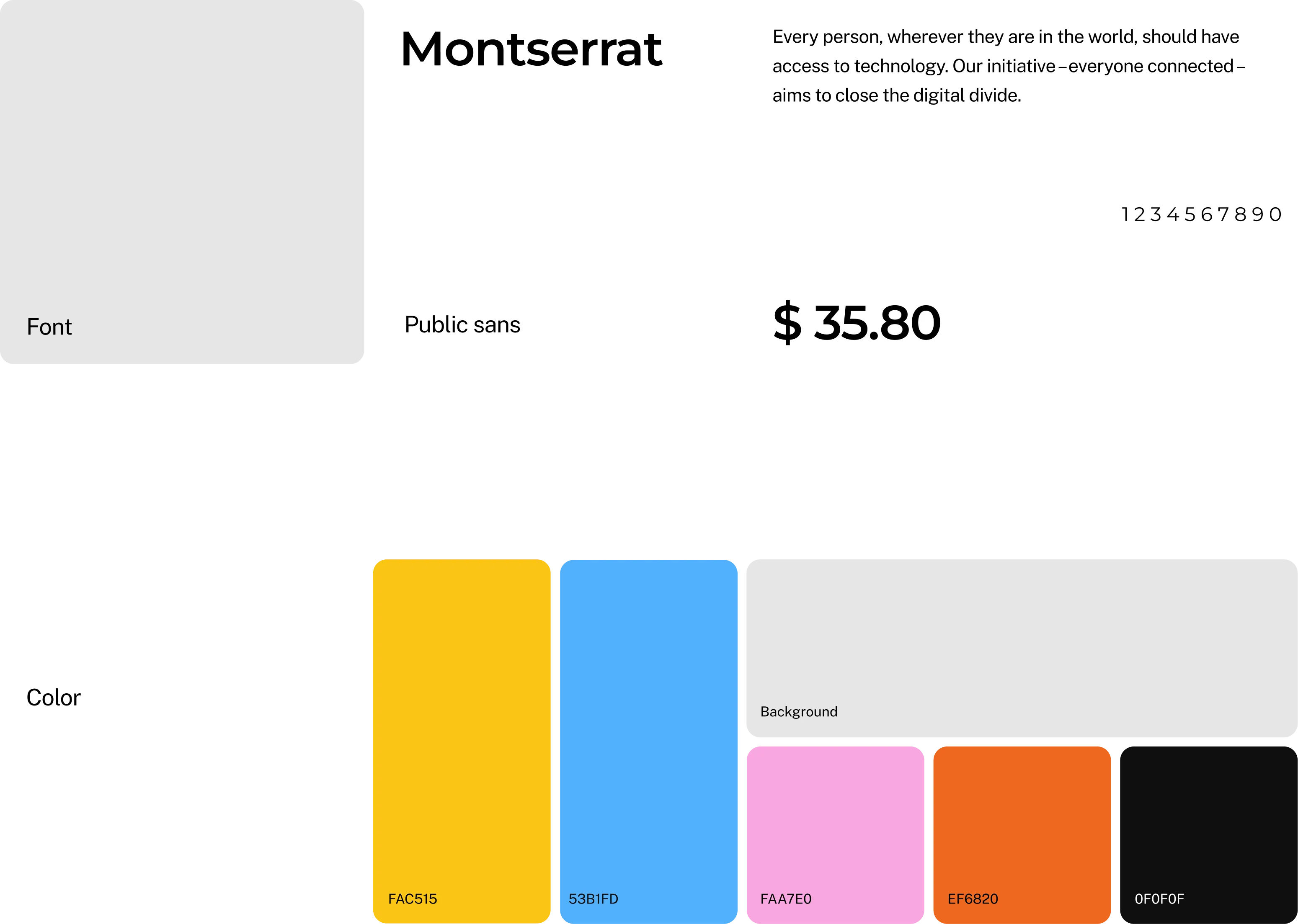
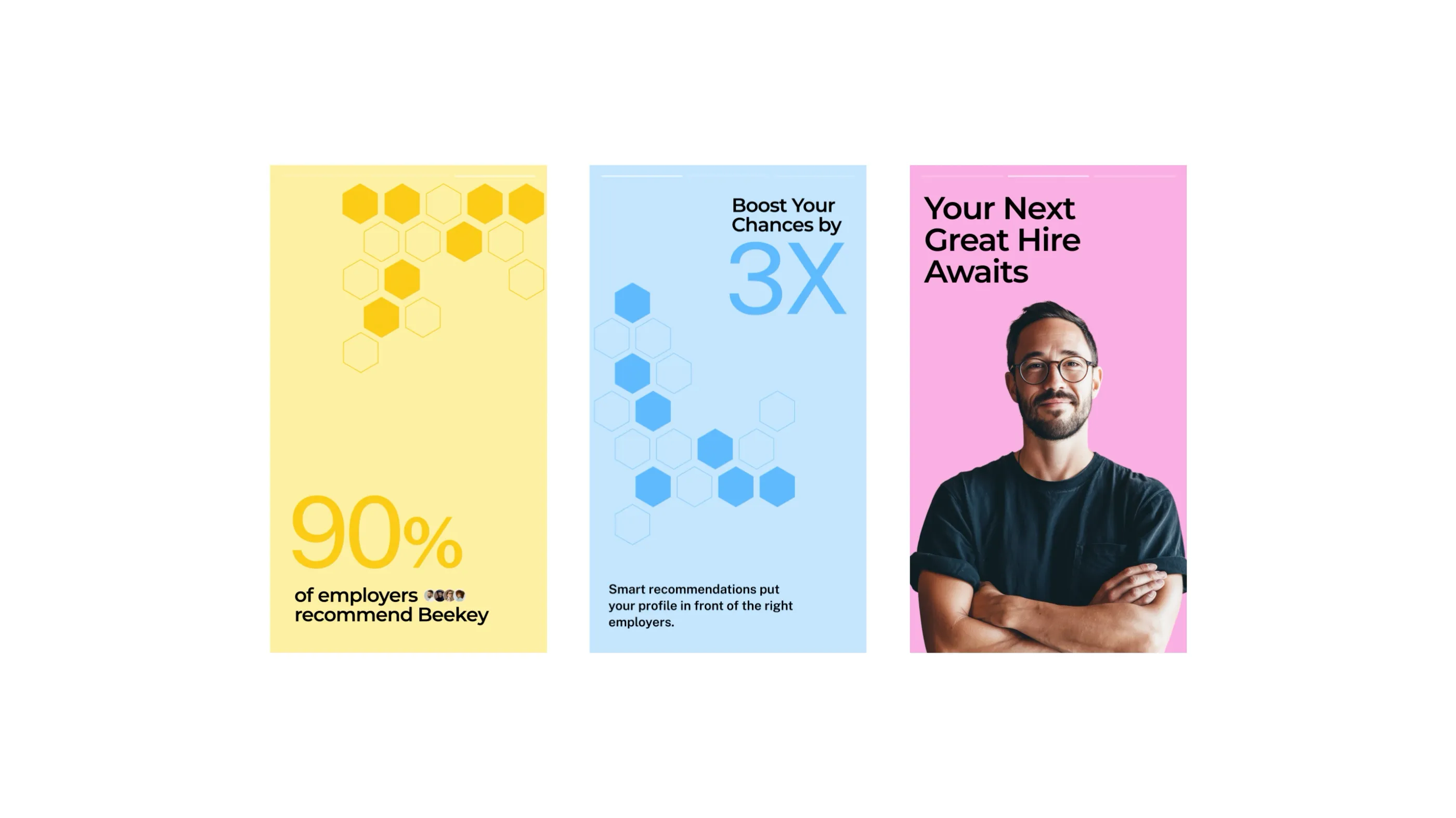
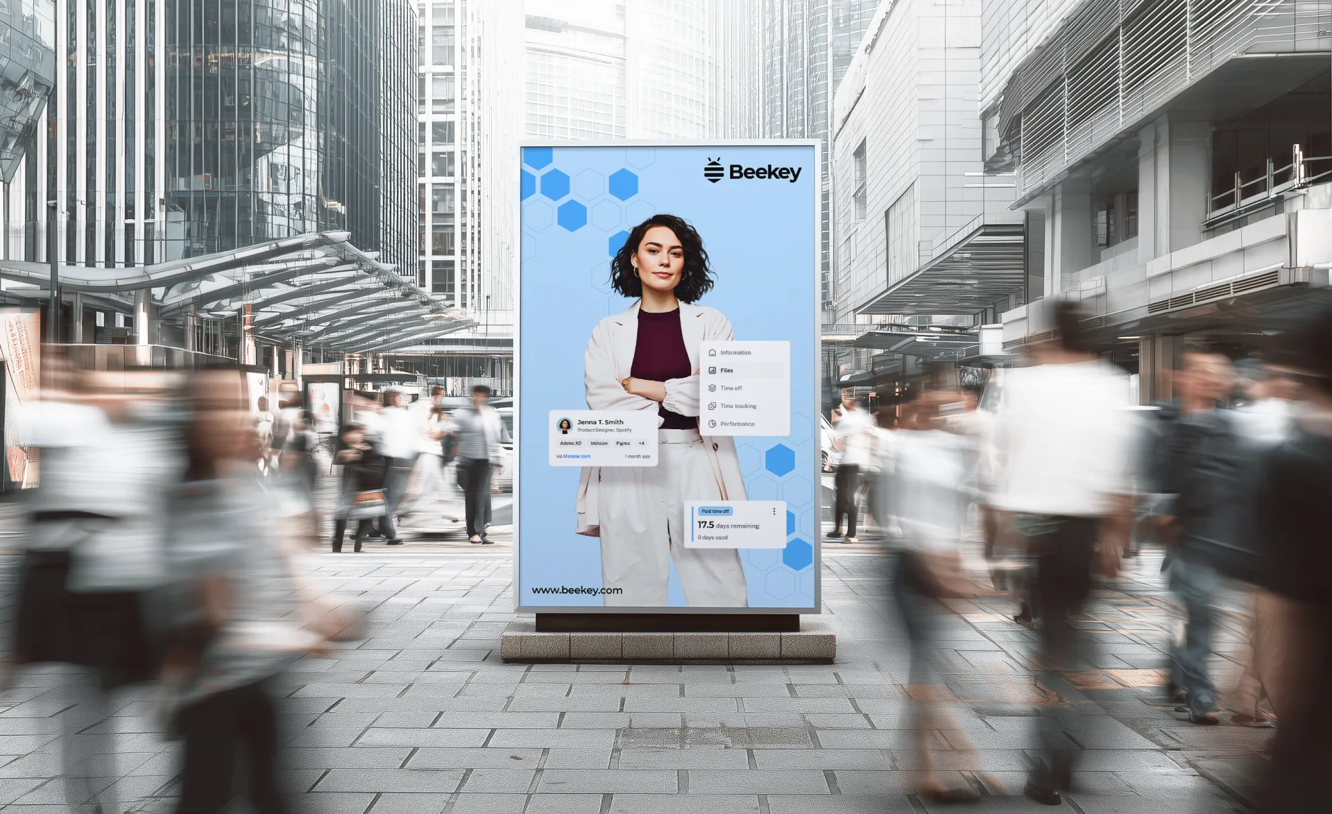
BeeKey’s color palette draws inspiration from both nature and professionalism, creating a system that is vibrant yet trustworthy. Honey Yellow embodies energy, optimism, and opportunity, while Borage Blue grounds the brand with strength and professionalism. Balanced by clean white and grey neutrals and elevated with a warm orange accent, the palette reflects innovation, clarity, and a forward-looking spirit.

.webp)

"The new BeeKey identity captures exactly who we are. Innovative, human, and future-focused. The hive-inspired design is both memorable and professional, helping us stand apart in a crowded recruitment market. Our team feels more confident presenting the brand, and early users have responded with overwhelming positivity."
The Octogle
Difference