Thinking
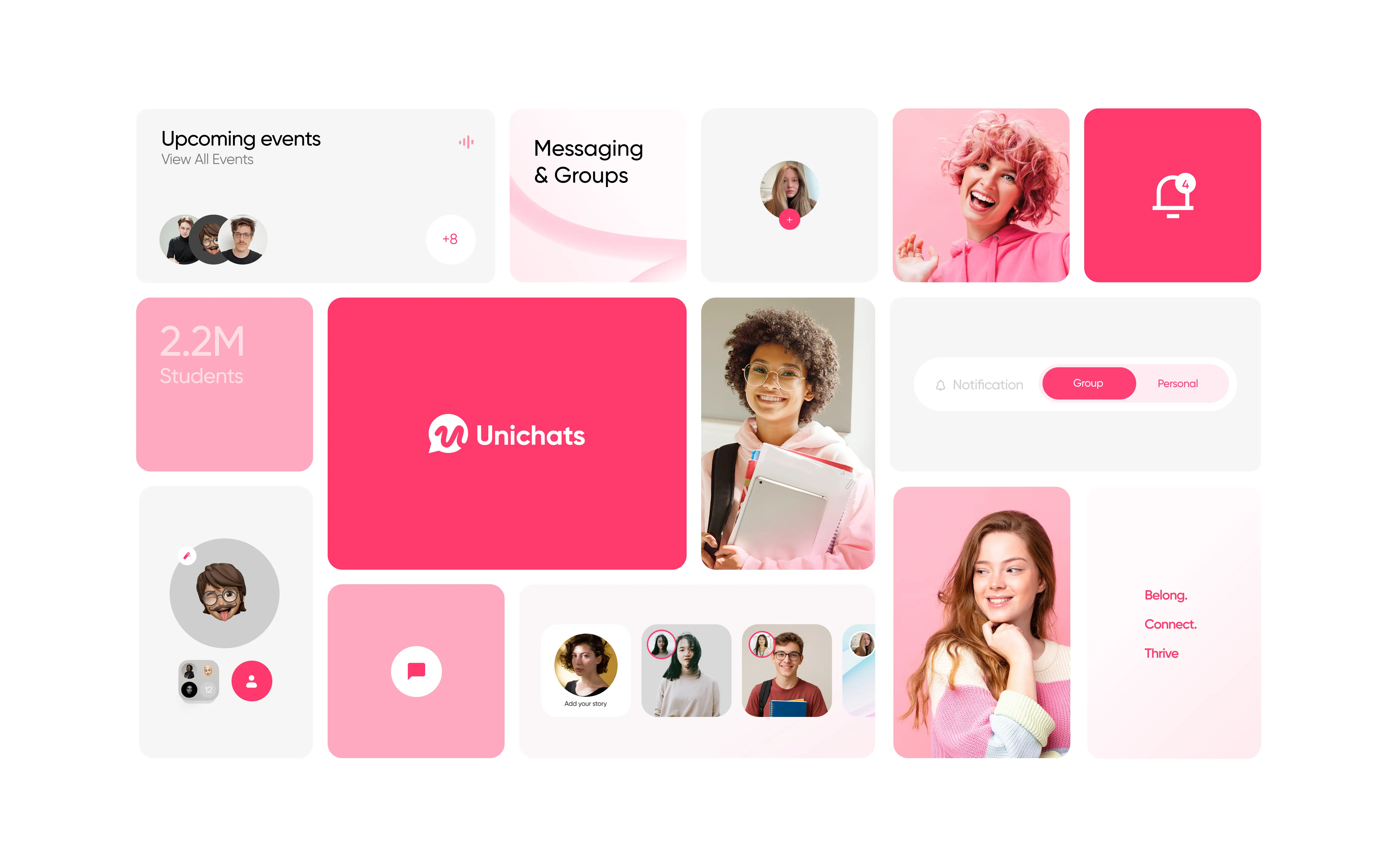
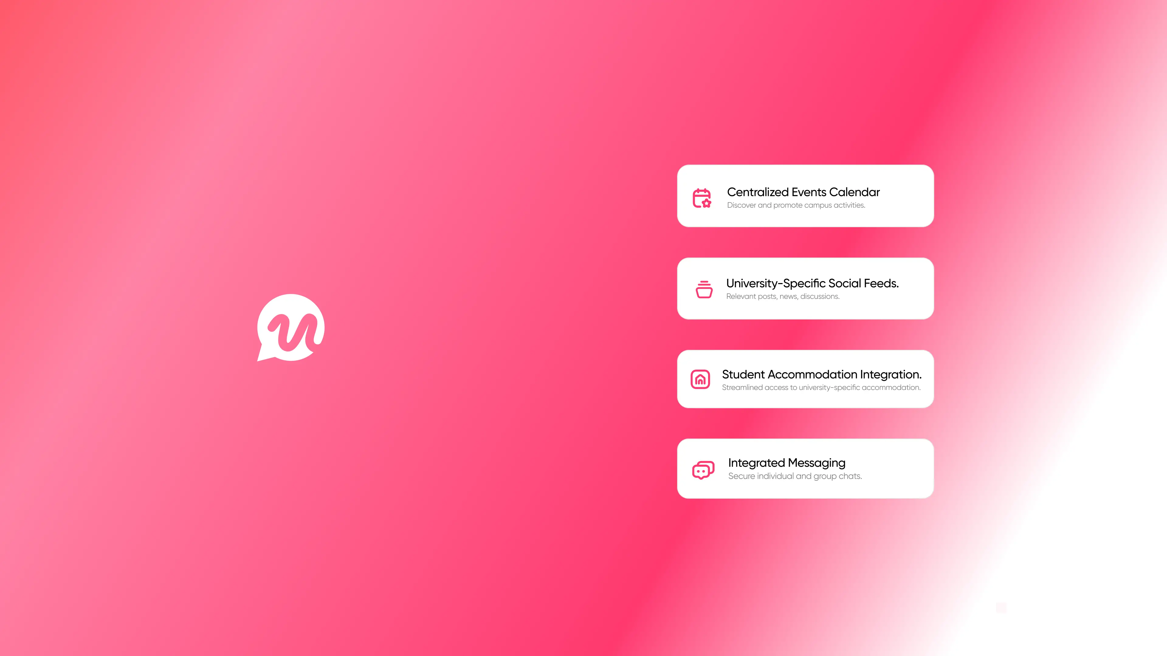
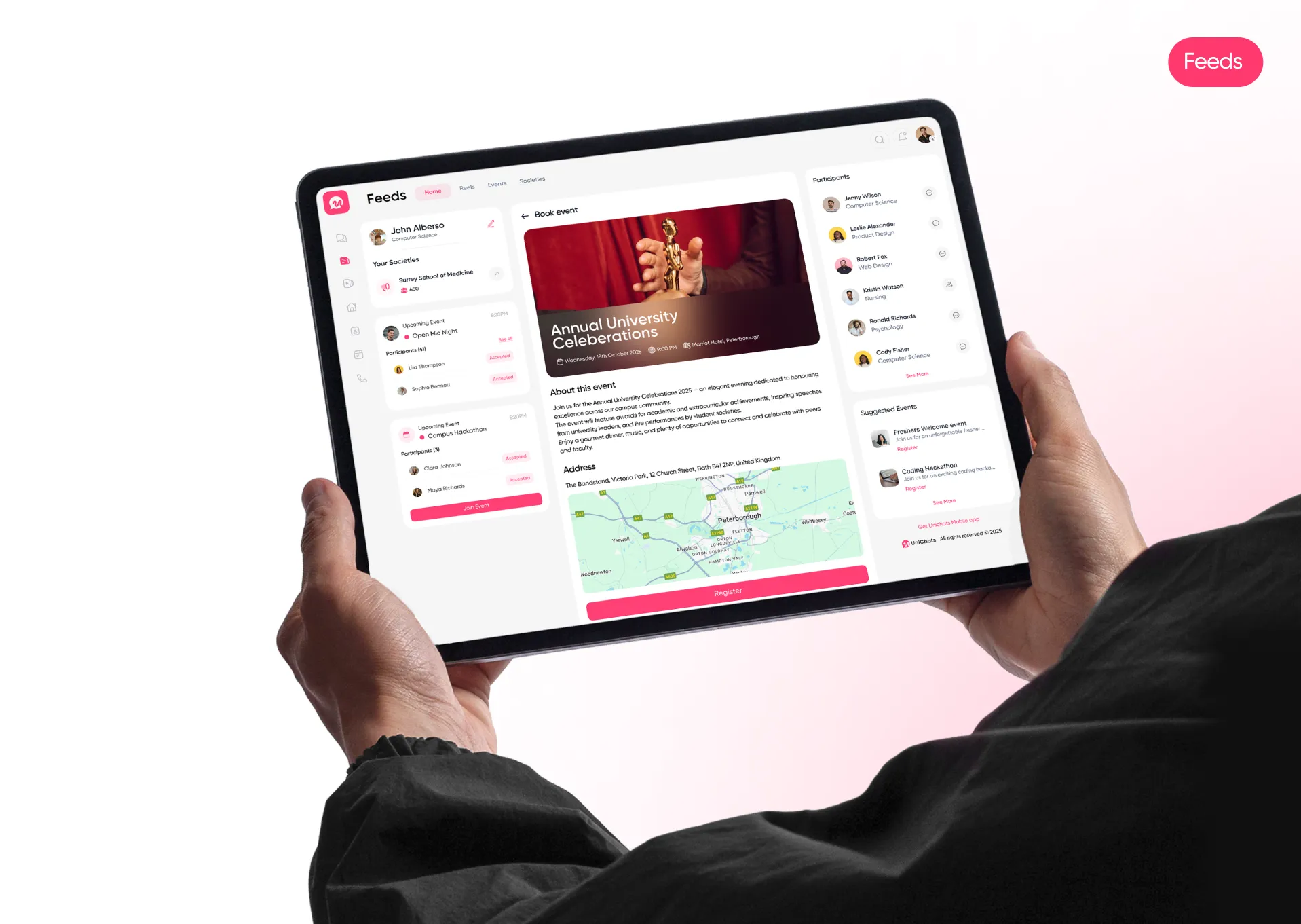
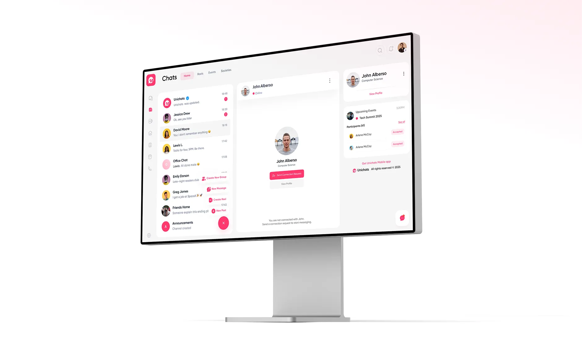
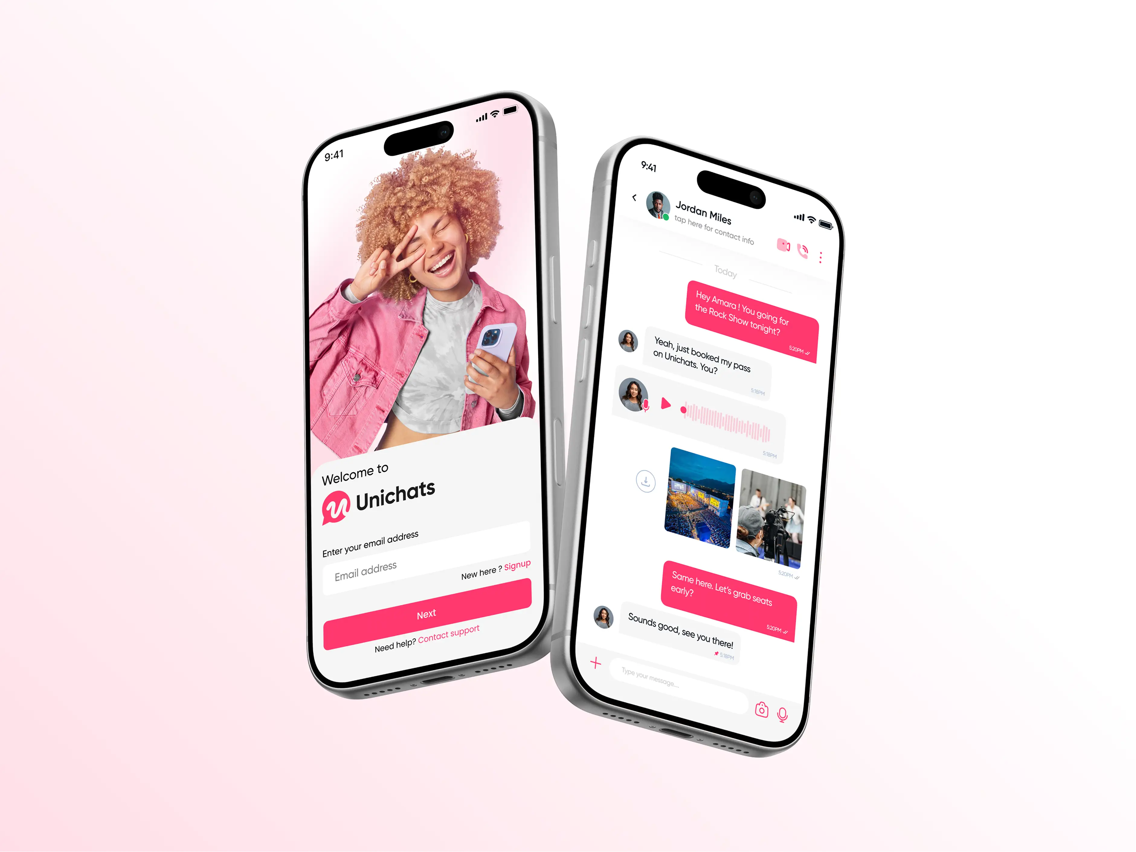
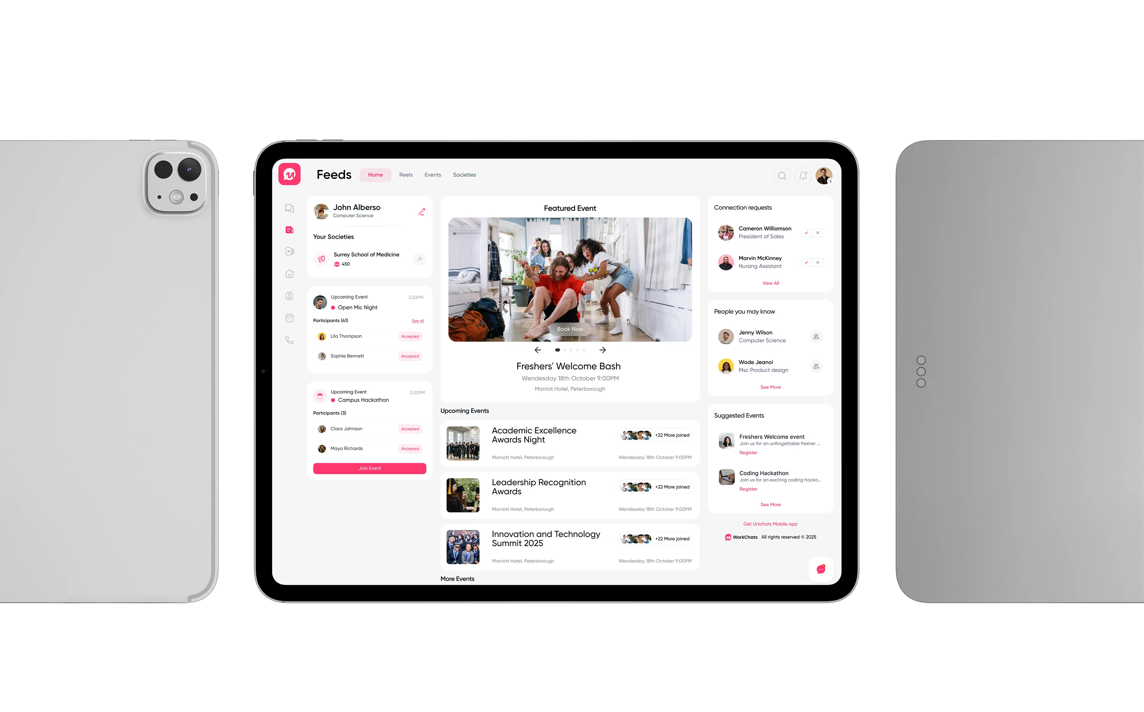
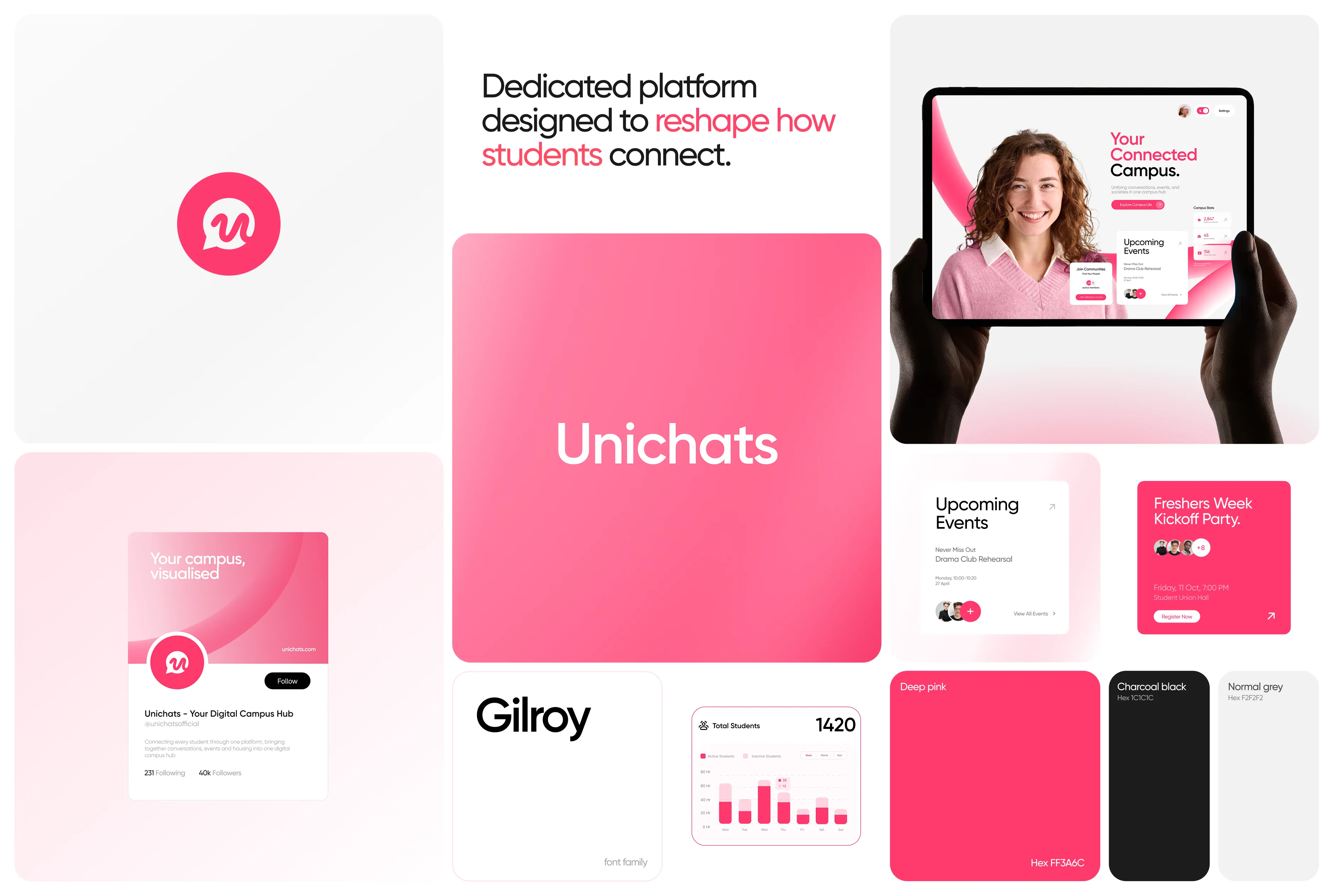
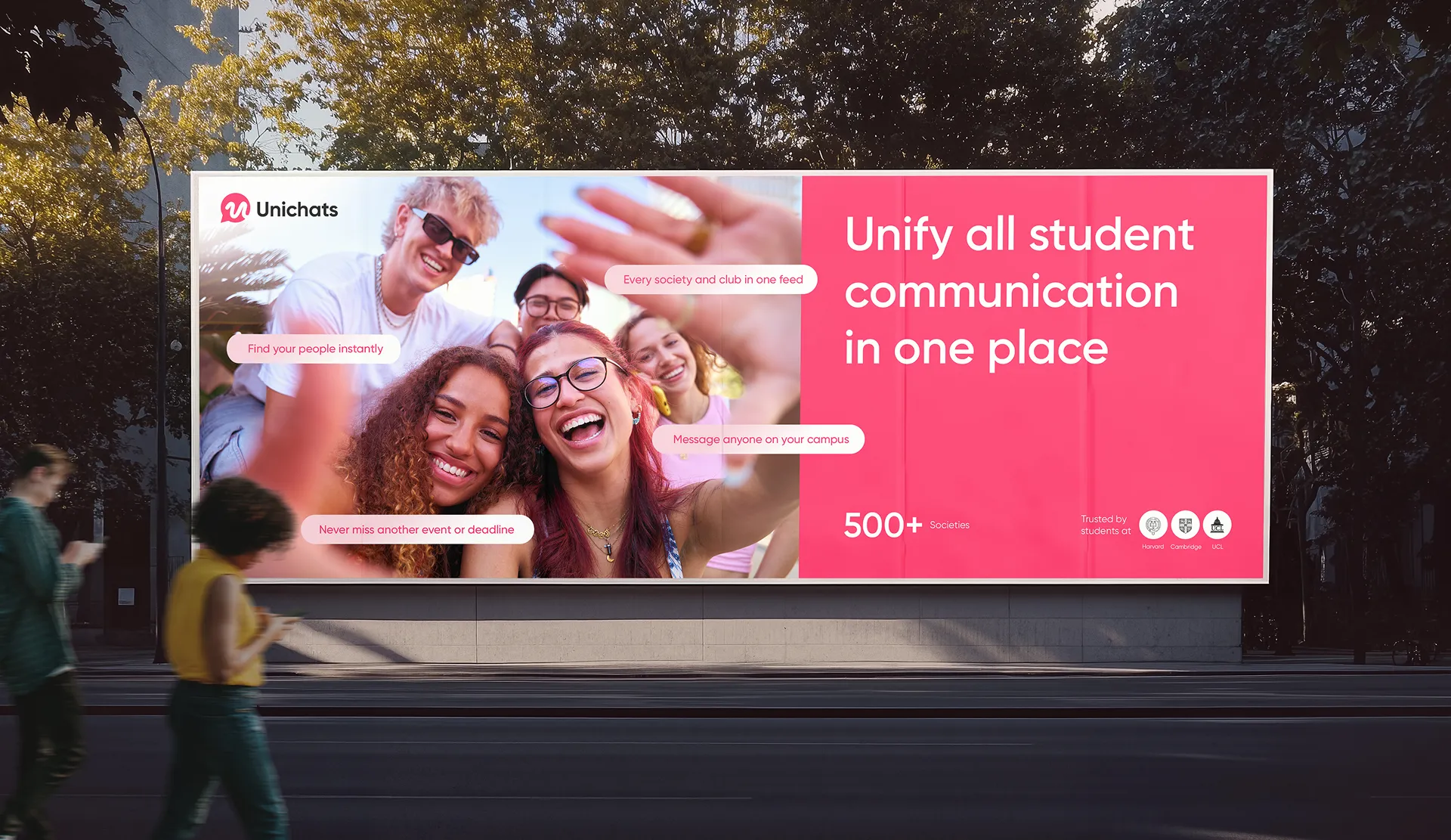
As student life becomes increasingly digital, campuses have struggled with a fragmented experience—students juggling multiple apps for communication, events, housing, and societies. Unichats was conceived not as another tool, but as a unified platform designed to become the digital backbone of campus life.
The opportunity was clear: to build a brand that feels globally connected yet locally rooted, one that resonates with Gen Z energy while offering universities a trusted, secure, and institutionally relevant system.
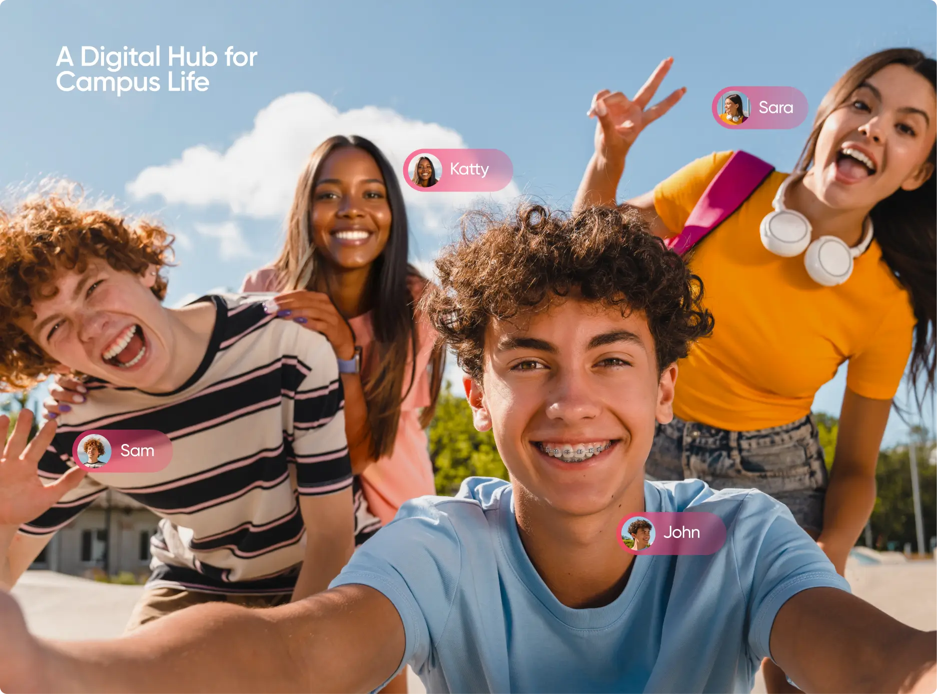
The identity needed to reflect more than functionality. It had to capture the spirit of campus culture—dynamic, social, and alive—while also embodying the reliability and credibility universities demand. Unichats launches with this dual promise: empowering students to thrive together and enabling institutions to foster community with confidence.
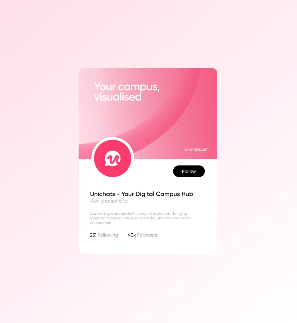
Connecting every student,
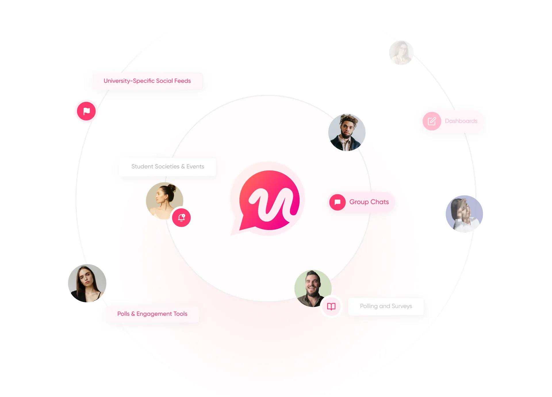
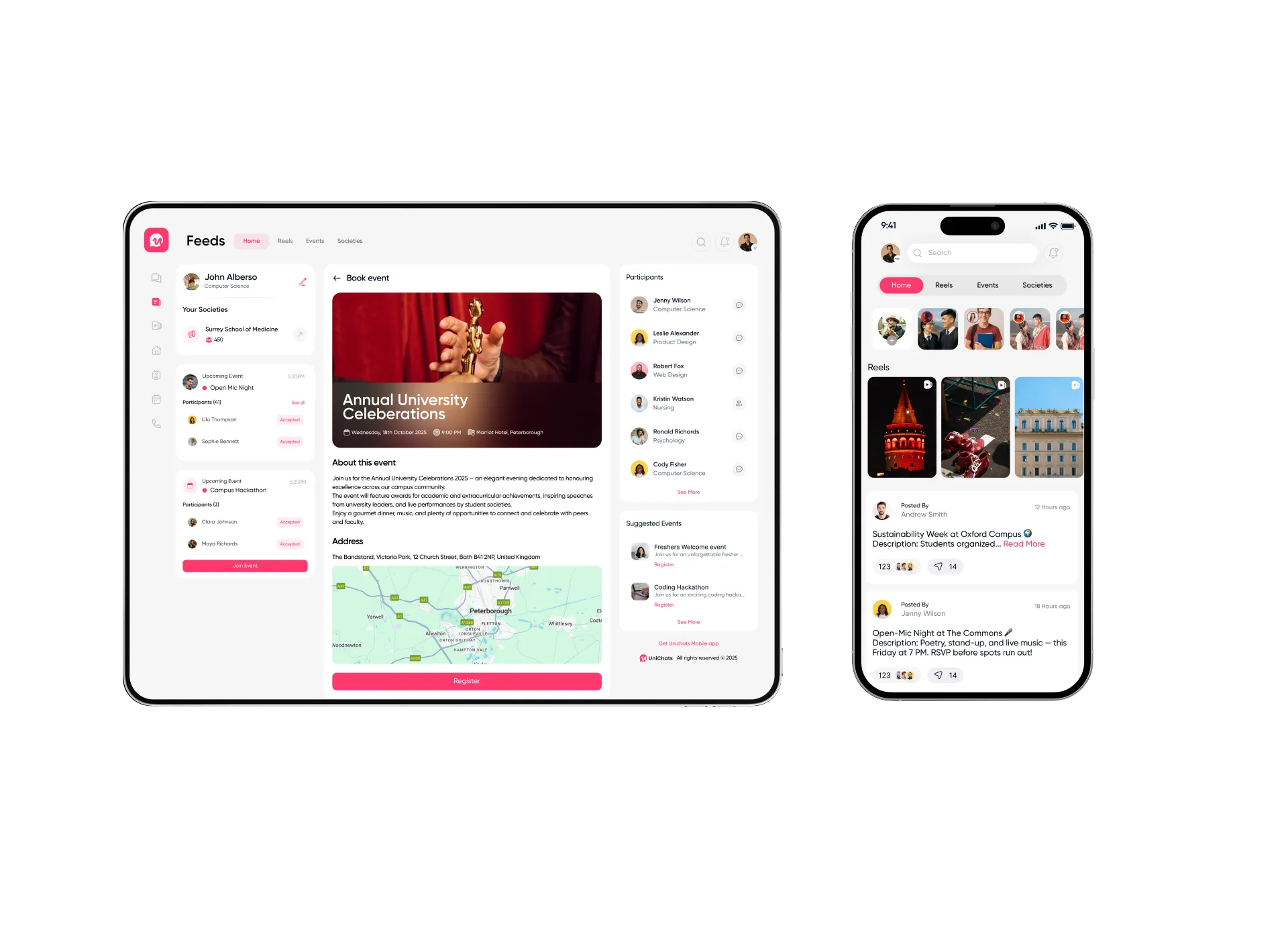
through one platform that unifies campus life, bringing together conversations, events, and housing into a seamless digital hub, empowering students to thrive and universities to engage with clarity.
.webp)


Implementation
Working closely with the Unichats founding team, our exploration focused on translating the idea of a connected campus into a bold and flexible identity system.
At its core, the brand needed to embody unity, vibrancy, and trust — values that resonate with students while reassuring institutions.
The logo-mark was designed as a symbol of convergence, representing multiple facets of campus life — societies, events, housing, and conversations — coming together in one place. From there, we built a broader design language of vibrant colors, modular shapes, and dynamic motion patterns that echo the pace of student life.
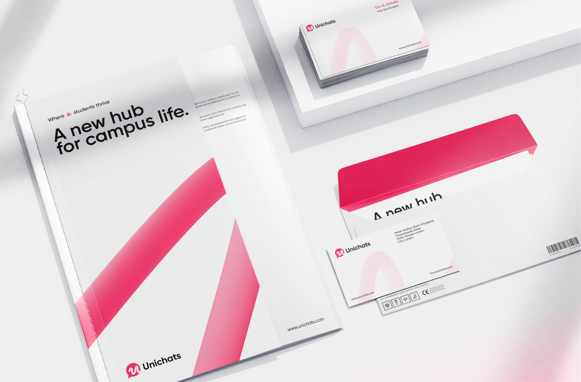
This kit of parts — including typography, iconography, illustration, and motion — was unified through a motion-first design system that keeps the brand lively, youthful, and instantly recognizable across both digital and physical touch-points.

The Octogle
Difference